Advance
We highly recommend you to fully understand this advance knowledgebase for the most effective usage of Bateaux Theme.
SEO Optimization Tool (Yoast SEO)
To optimize SEO performance of your site, we recommend you to use Yoast SEO plugin, which is compatible with Bateaux Theme. To activate plugin, go to Plugins, search for WordPress SEO by Yoast and click activate. You will find the Yoast control section in the post or page admin page.
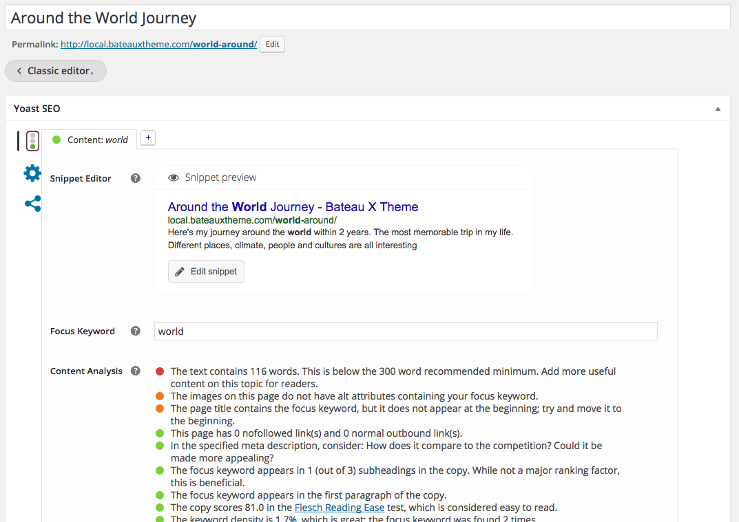
For post, Yoast SEO plugin will automatically detect the content in the classic editor itself, which means all the content can be analyzed by Yoast SEO plugin, However, for page which created from Blueprint, not all the content can be analyzed by plugin. Here are the elements which can't be analyzed.
Blog, Featured Post, Plugin Slider, Portfolio, Product, Product Category, HTML, Related Portfolio.
One Page Scroll
Here is the demo of one page scroll. You can create unique one page scroll among many pages of the site by creating unique menu just to use in that page. To create one page scroll, there are a few steps you have to follow.
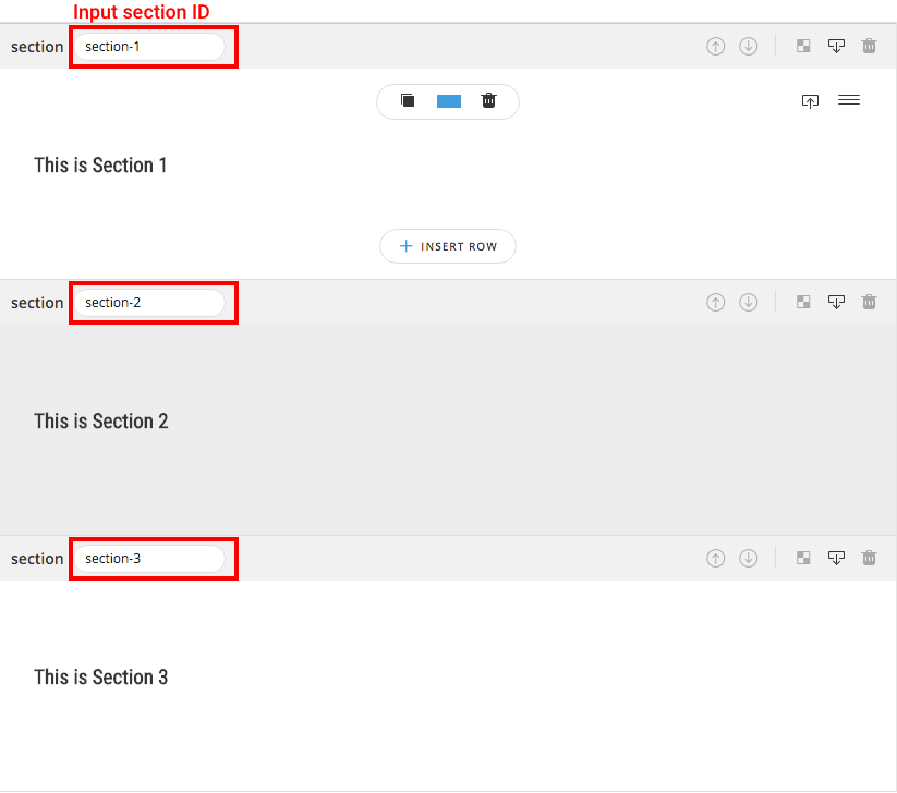
Step 1. Create page with multiple sections : make sure page you are creating is not in Full / Half Slide Page mode by clicking Page on Blueprint Menu bar and turn off both Full / Half Slide Page options. In every section you want to navigate, input the ID of the section like in screenshot (section-1, section-2, section-3). Note section ID must not contain any spacing (ex. "section 1" is unavailable ID).
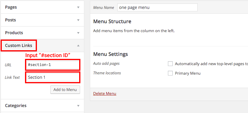
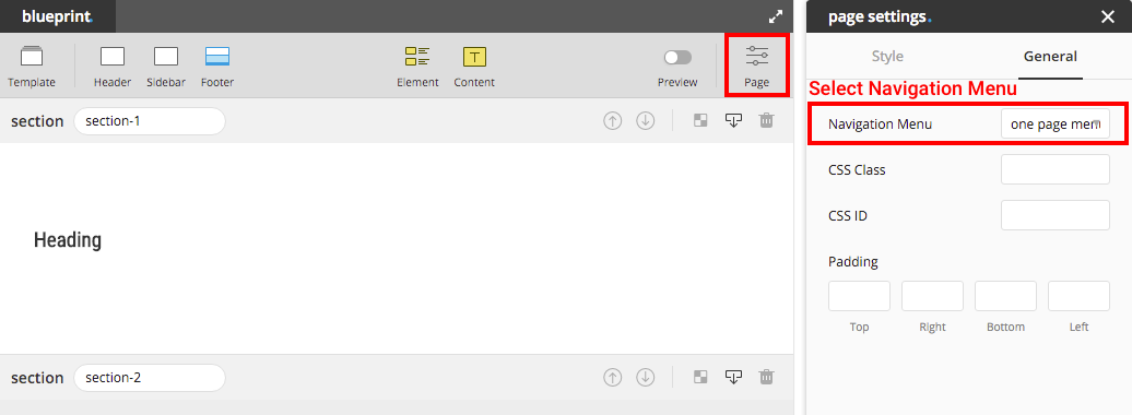
Step 2. Create navigation menu : create menu to navigate to section you created from step 1. Choose Custom Links and input "#" follow by section ID in URL text input field, then input the name of that menu in Link Text. Don't forget to save menu before close the page.
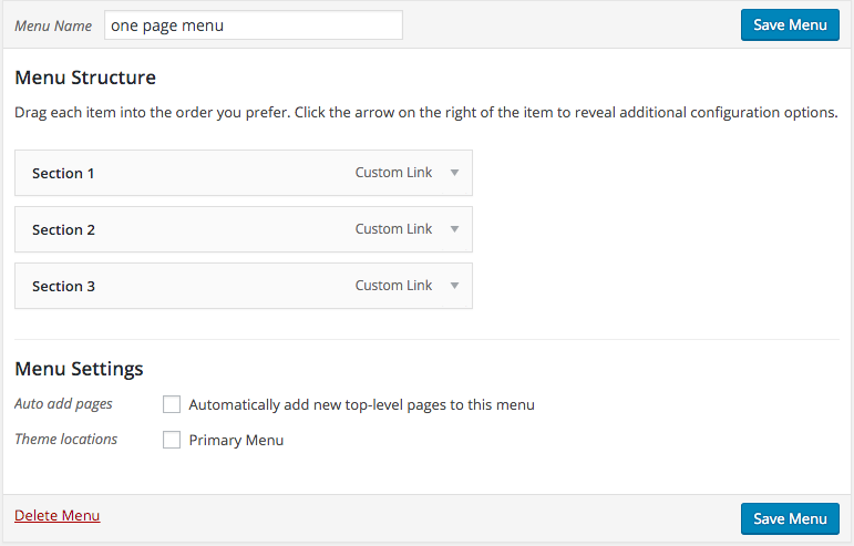
Step 3. Select navigation menu : in case navigation menu you created in step 2 is the primary menu then you can skip this step. If it's not, then select the menu created in step 2 from inspector of Page Setting on Blueprint menu bar.
Tip : from Blueprint, you can create button / image / text with a link navigate to section you want by adding "#section-id" as a URL of the link.
Full Slide Page
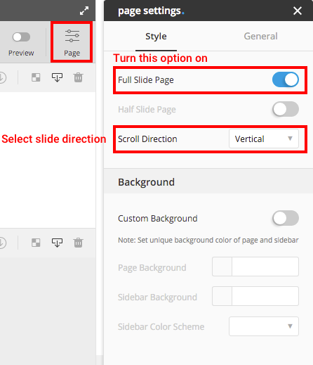
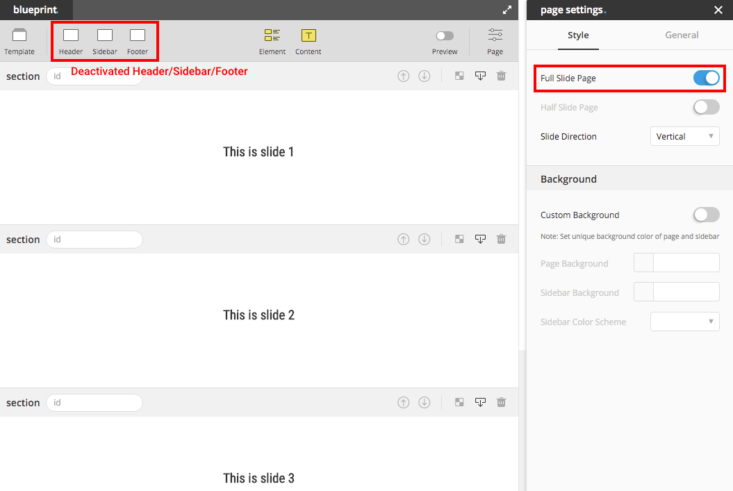
Here is the demo of full slide page. In this mode page title, footer and sidebar will be automatically disabled, we recommend you to turn these options to "None" first to prevent any error that might occur. All the sections in this mode will be automatically adjusted height fit to screen height without turning on the option Fit Screen Height in section inspector. Here are a few steps to create Full Slide Page.
Note : Full Slide Page can't be applied together with One Page Scroll menu.
Step 2. Create Multiple Sections : one slide in Full Slide Page represented by one section. All the sections will be automatically adjusted height fit to screen height. In the below screenshot, there will be 3 slides of this page.
Tip: try not to add too many elements in one section in this mode, the section might not have enough space to display all the elments inside.
Half Slide Page
Here is the demo of half slide page. Similar with Full Slide Page, page title footer and sidebar will be automatically disabled, we recommend you to deactivate these options first to prevent any error that might occur.
Note : Half Slide Page can't be applied together with One Page Scroll menu.
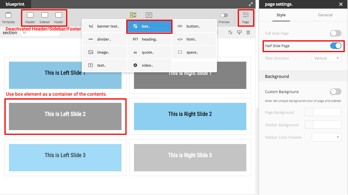
Step 1. Turn Half Slide Page Mode On : click Page Setting on Blueprint menu-bar and turn on the switch "Half Slide Page".
Step 2. Create A Section and A Row : in this mode, there must be only one section and one row with 2 columns.
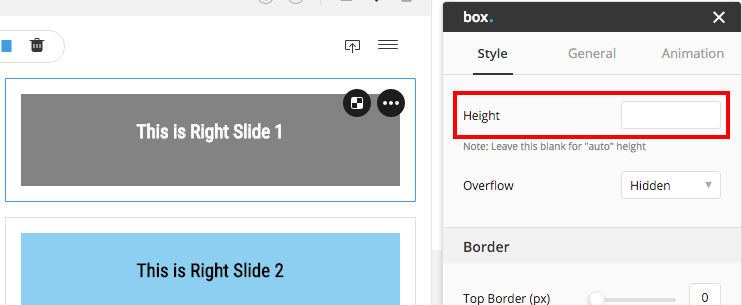
Step 3. Create Box Element : drag and drop box in to the columns provided from step 2. In both left and right side must have same amount of box.
Important Notice
leave box's height blank, otherwise slide's height would be distorted. parallax background of box won't be able to apply with half slide page, set parallax speed to 0 to prevent some display errors.
Step 4. Drag elements in to box : create each slide content by dragging elements or contents into each box.
Interactive Click Trigger
Interactive element, you can choose whether to hover or click to show the hidden state. To create "click" action to trigger interactive element, please follow the below instruction.
1. Disable Hover Action (optional) : you can choose to disable hover action to prevent conflict of usage or to prevent visitor from getting confuse.
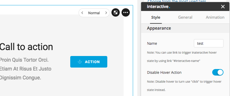
2. Input the name of interactive : name the interactive to any name you want.
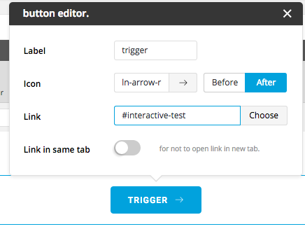
3. Create trigger : create the link from any element button, image, text or etc. with the URL "#interactive-{name}" {name} represent the name you input in the 2nd step.
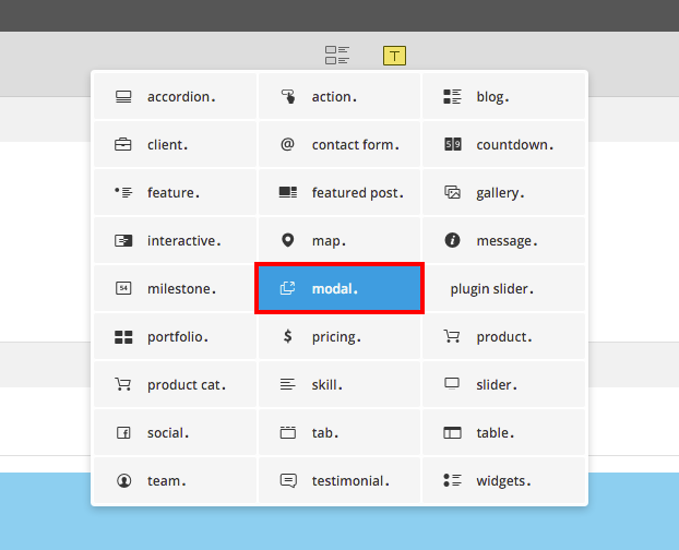
Modal / Popup
Here is the demo of modal or popup. Bateaux Theme supports 3 types of modal. Below explains how to create each type.
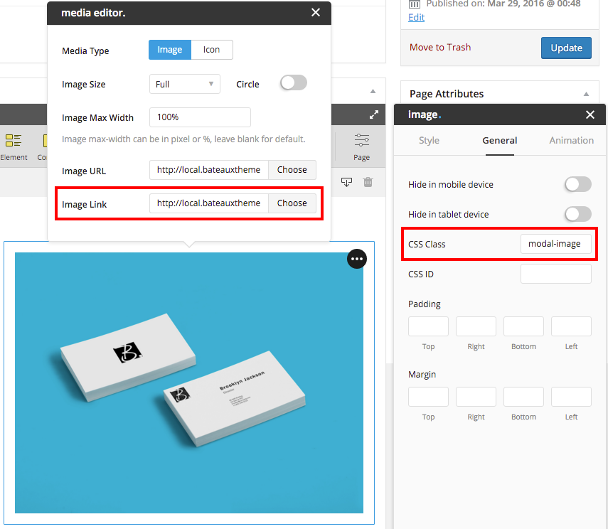
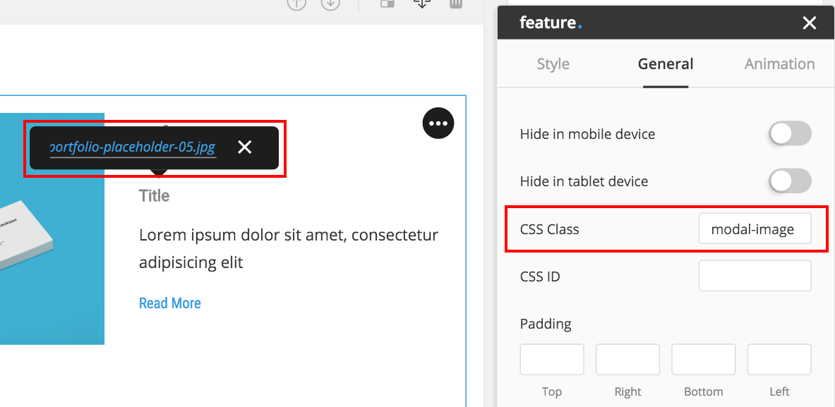
1. Image Modal
You can create image modal by simply add class "modal-image" to the element and input the image URL that you want to show in modal into the link to make it as a trigger. There are many ways to trigger (open) the modal, by using image / text / button as a link.
 Trigger Modal by Image Element
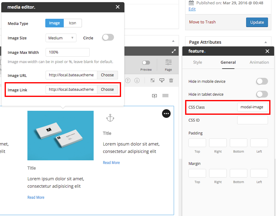 Trigger Modal by Feature Element using image
 Trigger Modal by Feature Element using text
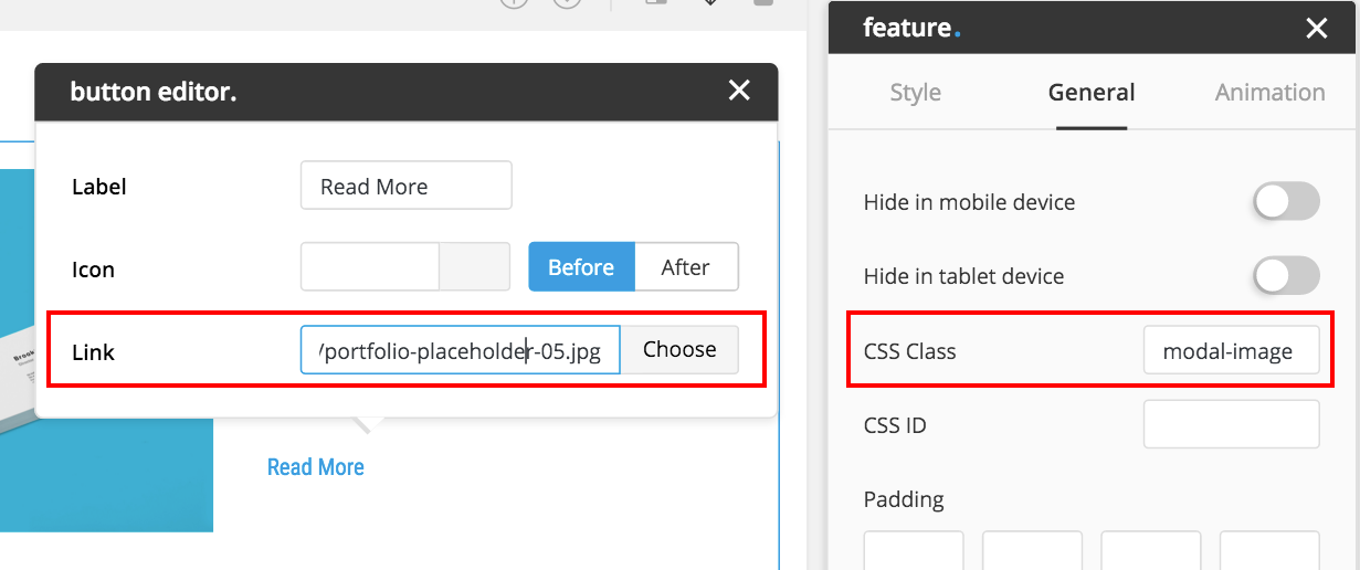 Trigger Modal by Feature Element using button
2. Embed Modal
Similar to create image modal, but change the added class name from "modal-image" to "modal-embed". In the URL input field you can put Youtube video URL, Vimeo video URL, Google-Map embed URL, SoundCloud embed URL, or Mixcloud embed URL into it. You can find how to get SoundCloud embed URL here (link must start with w.soundcloud), and here is how to get mixcloud embed URL (link must consist with mixcloud.com/widget).
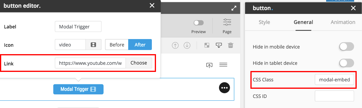 Trigger of Modal Youtube
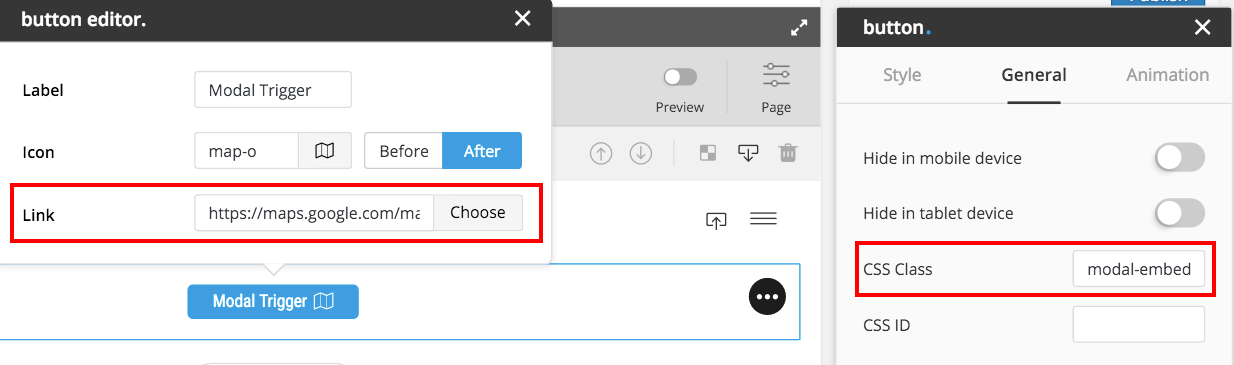 Trigger of Modal Google-Map
3. Content Modal
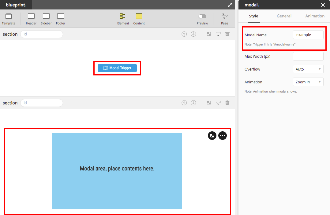
To create content modal is a bit different from 2 types of modal above. There must be 2 components to create this type of modal, modal box and modal trigger.
1. Modal Box : is an area to place the contents or elements inside. To create modal box, simply drag and drop Modal to the place you want and name to modal (modal's name must not contain any spacing).
Tip : Since modal is a light box that you don't have to care about location, we suggest you to drop modal box in anywhere that doesn't effect other contents' position in Blueprint, for example at the last section last row.
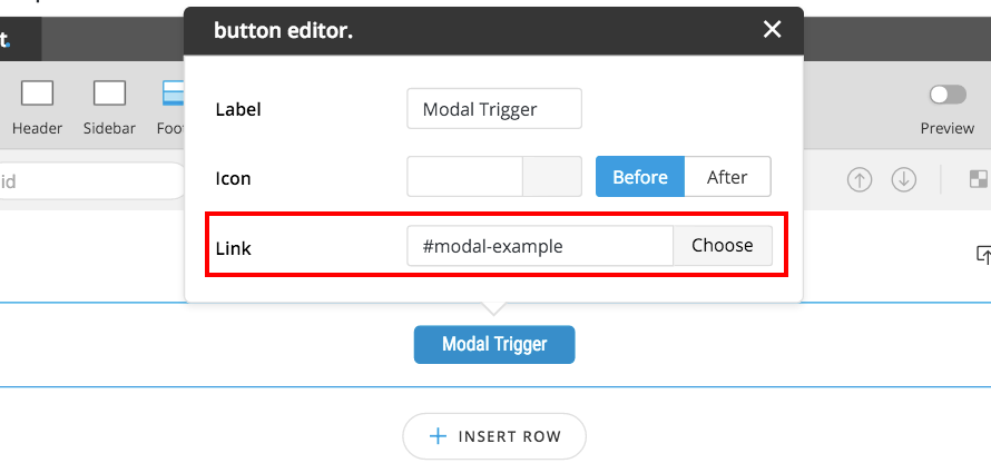
2. Modal Trigger : can be in any form, image/icon/text/button. Modal Box will popup after click the Trigger. To create the trigger, simply add link name as "#modal-{modal's name}" into the link input field.
 Make Button as a modal trigger.
Box Element
"Box" is the most advance element among all in Bateaux Theme. You can put almost every element (besides "modal, accordion, interactive and tab") inside the box, which mean you can set the background to almost every element. Box comes with height, overflow, border, background, vertical align options, you can create unlimited possibilities from these options with element or content inside the box. Here is the demo of how Box Element works. Another 2 options, Fix With Item ID and Equal Height Item ID, inside Advance section of inspector, are extra features of box which you can use to create equal height box or fixed box. Below are the explanation of how to apply these 2 options.
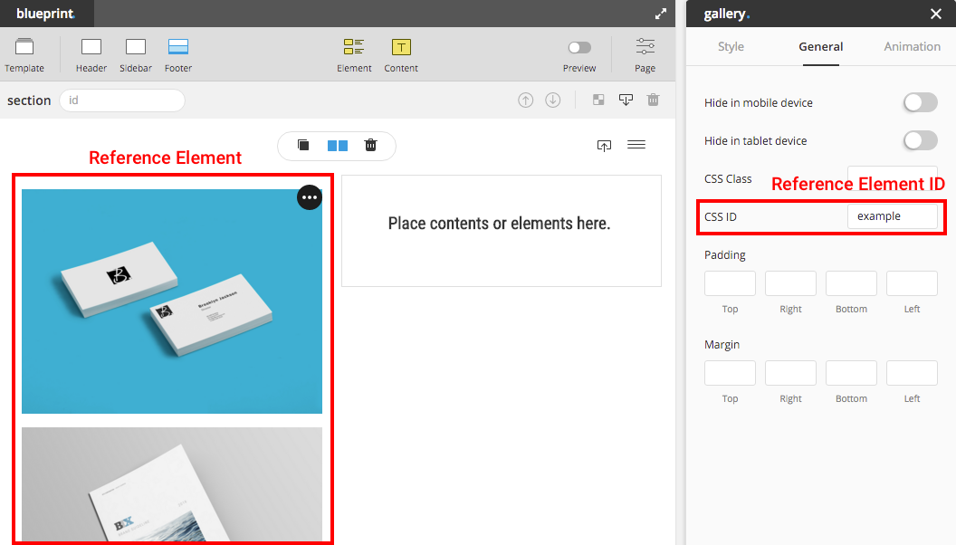
Fixed Box
Here is the demo of fixed box. Below are a few steps to create fixed box.
Step 1 Create an element as a reference to fix the box with. And input the css ID you like to that element.
Step 2 Drag Box into the same row but different column with the reference element created from step 1. Input the ID of reference element into the box element Fix With Item ID input field.
Note : If box and reference element are in the different row or in the same column, this feature won't work, and please keep in mind that box's height must always be shorter than the reference element.
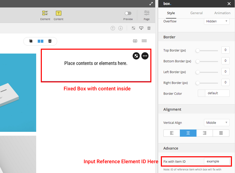
Step 3 Drag elements or contents you want to make it fixed into the box.
Extra tip : you can create more than one fixed box to fix with same reference element.
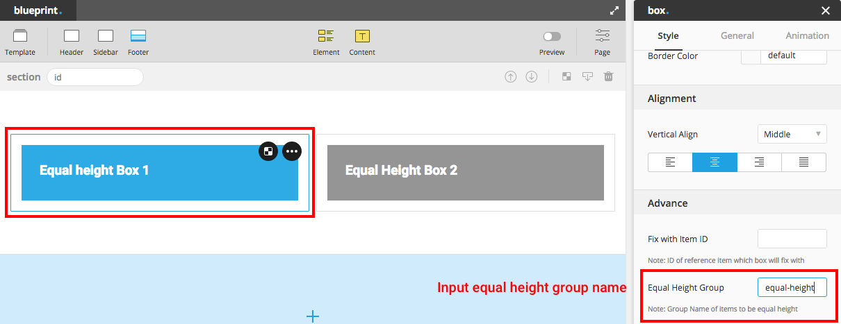
Equal Height Box
Here is the demo of equal height box. To create equal height boxed, here are a few steps.
Step 1 Create equal height boxes in the same row. Input the group name to the box that you want to make it equal height, boxes which have the same group name will have equal height. You can create as many equal height boxes as you like, however must be in the same row.
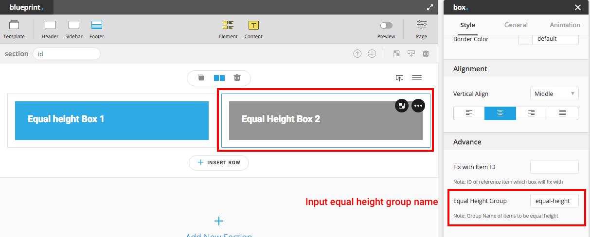
Step 2 Drag elements or contents you want into those boxes.
Extra tip : in Preview Mode, you will be able to see the genuine equal height.
Contact Form
Bateaux theme comes with package of contact form 7 plug in. Before creating, make sure you've already activated the plug in by going to admin panel Plugins and check for Contact Form 7. After activated the plug in, you will find contact form in the admin panel. Check the demo of contact form here.
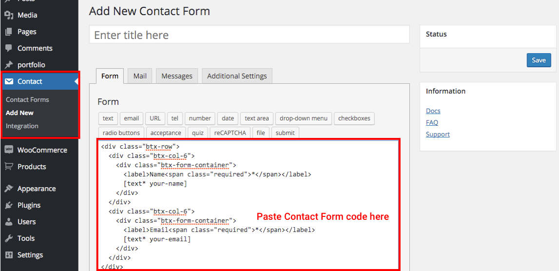
Click add new and choose one of the html of contact forms below here, copy and replace the original code in the contact form text area.
Contact Form 1 Column
<div class="btx-row">
  <div class="btx-col-12"><div class="btx-form-container">
    <label>Name <span class="required">*</span></label>
    [text* your-name]
  </div></div>
</div>
<div class="btx-row">
  <div class="btx-col-12"><div class="btx-form-container">
    <label>Email <span class="required">*</span></label>
    [text* your-email]
  </div></div>
</div>
<div class="btx-row">
  <div class="btx-col-12"><div class="btx-form-container">
    <label>Subject</label>
    [text your-subject]
  </div></div>
</div>
<div class="btx-row">
  <div class="btx-col-12"><div class="btx-form-container">
    <label>Your Message</label>
    [textarea your-message]
  </div></div>
</div>
<div class="btx-contactform-submit">[submit "Send"]</div>
Contact Form 2 Columns
<div class="btx-row">
  <div class="btx-col-6"><div class="btx-form-container">
    <label>Name <span class="required">*</span></label>
    [text* your-name]
  </div></div>
  <div class="btx-col-6"><div class="btx-form-container">
    <label>Email <span class="required">*</span></label>
    [text* your-email]
  </div></div>
</div>
<div class="btx-row">
  <div class="btx-col-12"><div class="btx-form-container">
    <label>Subject</label>
    [text your-subject]
  </div></div>
</div>
<div class="btx-row">
  <div class="btx-col-12"><div class="btx-form-container">
    <label>Your Message</label>
    [textarea your-message]
  </div></div>
</div>
<div class="btx-contactform-submit">[submit "Send"]</div>
Contact Form 3 Columns
<div class="btx-row">
  <div class="btx-col-4"><div class="btx-form-container">
    <label>Name <span class="required">*</span></label>
    [text* your-name]
  </div></div>
  <div class="btx-col-4"><div class="btx-form-container">
    <label>Email <span class="required">*</span></label>
    [text* your-email]
  </div></div>
  <div class="btx-col-4"><div class="btx-form-container">
    <label>Subject</label>
    [text your-subject]
  </div></div>
</div>
<div class="btx-row">
  <div class="btx-col-12"><div class="btx-form-container">
    <label>Your Message</label>
    [textarea your-message]
  </div></div>
</div>
<div class="btx-contactform-submit">[submit "Send"]</div>
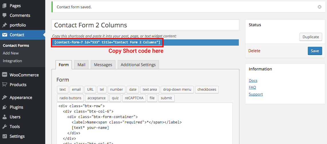
Click Save, and there will be contact form shortcode appears. You can copy contact form shortcode to use in Contact Form element in Blueprint or anywhere supported shortcode, ex. Text in Blueprint, post or text widget.
Single Portfolio Settings
Bateaux Theme integrates Blueprint with single portfolio, so you can create unlimited styles of portfolio. The most convenient way to create single portfolio is using template which come with the theme or made by yourself, then all you have to do is just change contents. Single portfolio's Blueprint has some more extra options from page's Blueprint which are hidden in page-settings, that's why we call this Single Portfolio Settings.
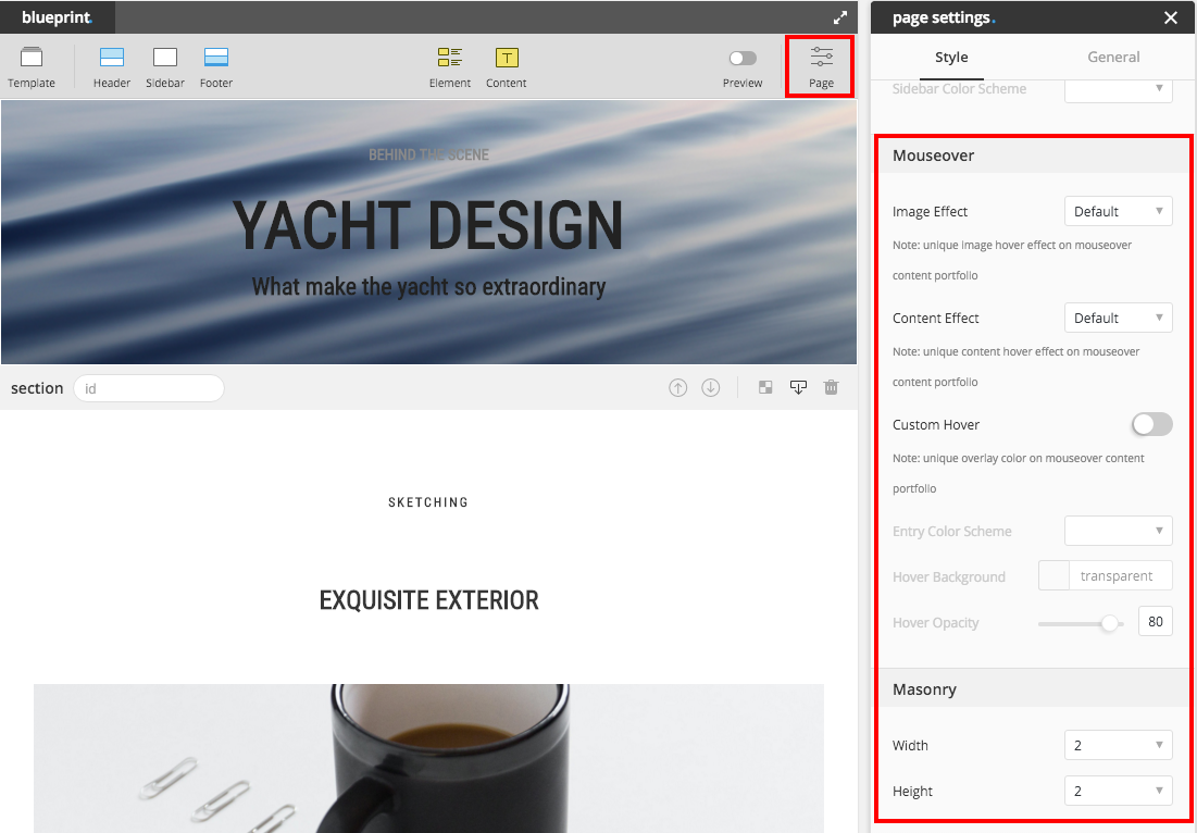
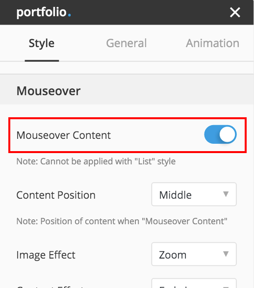
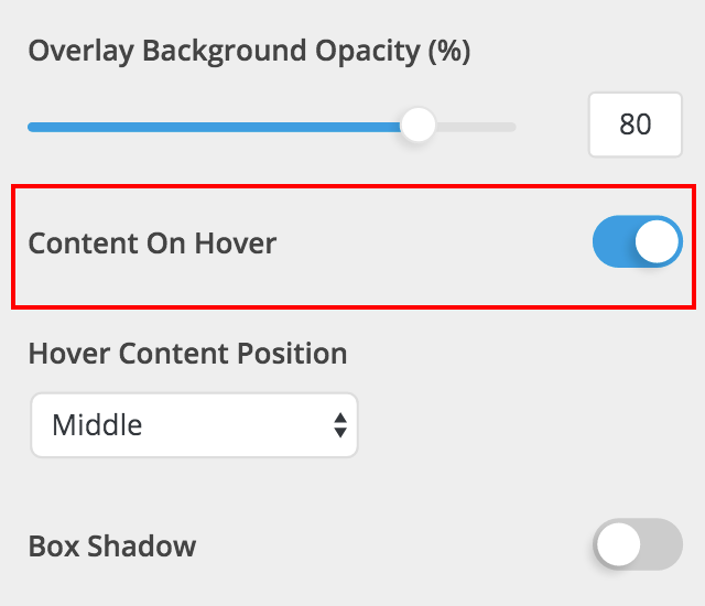
These extra options are in Mouseover and Masonry section, which will apply with only Mouseover Content portfolio element or portfolio archive and blog element or blog archive. Here is the demo of Mouseover Content portfolio.
To create unique style of current portfolio/blog's entry which will appear in portfolio/blog element or portfolio/blog archive, below are options that you can make it different from global settings.
- Image Effect : set animation of portfolio/blog's featured-image when hover.
- Content Effect : set animation of portfolio/blog's content when hover.
- Custom Hover : switch this on, in case you want to adjust unique color
- Entry Color Scheme : color scheme of the entry, set light if hover background is light color and set dark if hover background is dark color. This option will apply only when custom hover switched on.
- Hover Background : this option will apply only when custom hover switched on.
- Hover Opacity : this option will apply only when custom hover switched on.
- Masonry Width : for setting Masonry Various Width portfolio/blog.
- Masonry Height : for setting Masonry Various Height portfolio/blog.
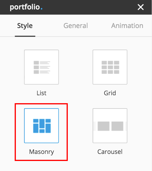
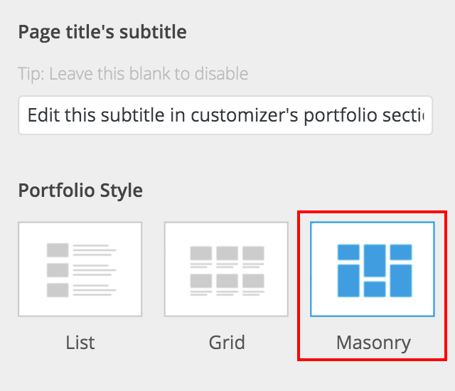
Masonry Various Width
If you don't know what masonry various width look like, here is the demo, some call this layout "Metro". In Bateaux Theme you can create this kind of layout with 3 elements, Blog, Portfolio and Gallery.
Portfolio / Blog
There are 2 conditions to create the portfolio masonry various width, Masonry style with Mouseover Content. For portfolio/blog element created from Blueprint you can find these 2 options in the portfolio/blog element inspector. For portfolio/blog archive page, you can find these 2 options in in Customizer > Portfolio and Customizer > Blog
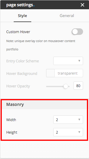
To set width and height of each portfolio/blog entry, go to Single Portfolio or Single Post admin page and open Page Settings. You will find options Width and Height in the section Masonry. Choose your desired width and height, or choose "1" for default. For example, if you choose width "2", the entry of editing portfolio in portfolio element or portfolio archive will have width 2 times of the normal column width you set.
Note : "Height" will only take effect when image ratio of portfolio/blog element or archive portfolio/blog is not "original".
Gallery
Making Gallery Masonry is very simple, drag element gallery in to place in anywhere you want. Change the style to "Masonry" and set other options as you desire.
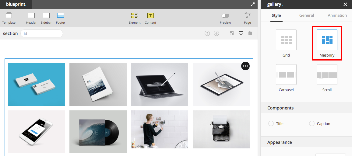
Next step to set the width and height of each image, go to admin panel Media and choose attachment you will find options Masonry Width and Masonry Height. Set width and height as you want, or choose "1" for default.
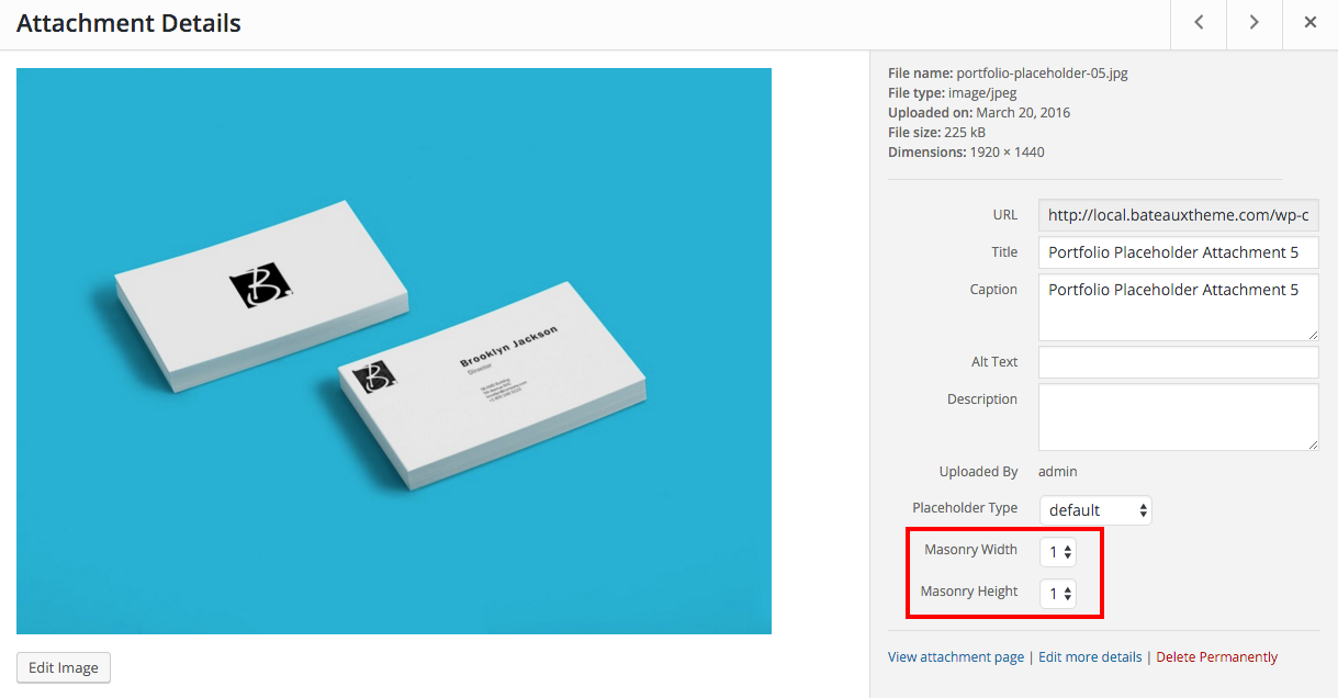
Note : "Masonry Height" will only take effect when image ratio of gallery is not "original".
Shortcode
Bateaux Theme comes with a set of shortcode where you can use in post, elements (Blueprint), or text widget. In Blueprint, anywhere that can be edited by text editor support shortcode, which means you can put shortcode in almost everywhere from text element to feature element. Meanwhile, in post you can use shortcode generator to create some types of shortcode.
Structure of shortcode.
[shortcodename {config's key}="{value}"]{content}[/shortcodename]
For property related with color, Bateaux Theme allows user to use custom hex-color or 14 sync colors with the shortcode, in case user change any of this sync colors, that shortcode will still be synchronized. Here are the list of sync colors value to use with shortcode.
| Color Name | Value |
|---|---|
| primary brand | primary_brand |
| secondary brand | secondary_brand |
| Light Scheme Primary Text | primary_text |
| Light Scheme Secondary Text | secondary_text |
| Light Scheme Primary Background | primary_background |
| Light Scheme Secondary Background | secondary_background |
| Light Scheme Border | border |
| Dark Scheme Primary Text | dark_primary_text |
| Dark Scheme Secondary Text | dark_secondary_text |
| Dark Scheme Primary Background | dark_primary_background |
| Dark Scheme Secondary Background | dark_secondary_background |
| Dark Scheme Border | dark_border |
| Custom 1 | custom_1 |
| Custom 2 | custom_2 |
Here are the options and configurations of available shortcodes.
1. Text (name: btx_text)
You can make infinite style of text from below properties.
| Property | Requirement | Config's key | Value |
|---|---|---|---|
| color | optional | color | hex or sync color |
| background-color | optional | bg_color | hex or sync color |
| font-size | optional | font_size | number or number + unit |
| font-weight | optional | font_weight | lighter/bold/bolder/100-900 |
| font-type | optional | font | primary/secondary/custom_a/custom_b/custom_c |
| letter spacing | optional | letter_spacing | number or number + unit |
| content | required | text or shortcode |
[btx_text color="#000" bg_color="#fff" font_size="20px" font="secondary" letter_spacing="2px"]This is example[/btx_text]
2. Dropcap (name: btx_dropcap)
Make dropcap to use with post or any content in the site.
| Property | Requirement | Config's key | Value |
|---|---|---|---|
| color | optional | color | hex or sync color |
| background-color | optional | bg_color | hex or sync color |
| border-color | optional | border_color | hex or sync color |
| font-size | optional | font_size | number or number + unit |
| font-type | optional | font | primary/secondary/custom_a/custom_b/custom_c |
| circle | optional | circle | boolean (true/false) |
| content | required | text or shortcode |
[btx_dropcap circle="true"]D[/btx_dropcap]
3. Icon (name: btx_icon)
Make custom icon on divider element, between content in text element or wherever you want.
| Property | Requirement | Config's key | Value |
|---|---|---|---|
| icon name | required | icon | et-anchor/check and etc. |
| style | optional | style | plain/border/fill/fill-square/border-square |
| color | optional | color | hex or sync color |
| size | optional | size | small/medium/large/x-large |
| hover style | optional | hover_style | plain/border/fill/fill-square/border-square |
| hover color | optional | hover_color | hex or sync color |
[btx_icon icon="anchor" style="fill" color="primary_brand" size="large" hover_style="border" hover_color="secondary_brand"][/btx_icon]
4. Code (name: btx_code)
Make <pre> tag to contain your code.
| Property | Requirement | Config's key | Value |
|---|---|---|---|
| color | optional | color | hex or sync color |
| background-color | optional | bg_color | hex or sync color |
| border-color | optional | border_color | hex or sync color |
| font-size | optional | font_size | number or number + unit |
| font-type | optional | font | primary/secondary/custom_a/custom_b/custom_c |
| content | required | text or shortcode |
[btx_code bg_color="#333" border_color="#000"]This is code section $html or @javascript[/btx_code]
5. Tooltip (name: btx_tooltip)
Create tooltip to describe more info to the content from below properties.
| Property | Requirement | Config's key | Value |
|---|---|---|---|
| tooltip-content | required | content | text |
| tooltip-position | optional | position | top/ bottom /left /right |
| content | required | text or shortcode |
[btx_tooltip content="this will pop up" position="right"]Hover here to popup tooltip.[/btx_tooltip]
6. Image (name: btx_image)
Create image element in the post or place that cannot drag and drop element inside by using page-builder.
| Property | Requirement | Config's key | Value |
|---|---|---|---|
| image ID | required | image_id | ID of image |
| size | optional | size | thumbnail/medium/bateaux_medium/medium_large/large/bateaux_large/full |
| ratio | optional | ratio | auto/1x1/3x2/2x3/4x3/3x4/16x9 |
| position | optional | position | overlapleft/left/center/right/overlapright |
| on click action | optional | on_click | none/popup/link |
| link | optional | link | Link URL |
| open link in same tab | optional | target_self | true/false |
| image circle | optional | circle | true/false |
| content (caption) | optional | text or shortcode |
[btx_image image_id="12"]Here's the caption[/btx_image]
7. Gallery (name: btx_gallery)
Create gallery in your desire style in tab, accordion, text element or wherever.
| Property | Requirement | Config's key | Value |
|---|---|---|---|
| images ID | required | images | "ID1, ID2, ID3" |
| style | optional | style | grid/masonry/carousel |
| No of Columns | optional | no_of_columns | number (integer) |
| Adaptive Height | optional | adaptive_height | boolean (true/false) |
| image popup | optional | popup | boolean (true/false) |
| spacing | optional | spacing | number |
| image size | optional | image_size | thumbnail/medium/bateaux_medium/medium_large/large/bateaux_large/full |
| image ratio | optional | image_ratio | auto/1x1/3x2/2x3/4x3/3x4/16x9 |
| image hover effect | optional | hover | none/zoom/slowzoom/blur/rotate/colorize/greyscale |
| content (caption) | optional | text or shortcode |
[btx_gallery images="6,5,3" no_of_columns="4" image_ratio="3x2"]Here's a gallery caption[/btx_gallery]
8. Video (name: btx_video)
Create self-hosted or external video in tab, accordion, text element or wherever.
| Property | Requirement | Config's key | Value |
|---|---|---|---|
| video URL | required | video_url | URL of video |
| type | required | type | self-hosted / external |
| width | optional | width | number (integer) |
| poster URL | optional | poster_url | URL of poster |
| position | optional | position | overlapleft/left/center/right/overlapright |
[btx_video video_url="www.bateauxtheme.com/wp-content/uploads/image.jpg" type="self-hosted"][/btx_video]
9. Quote (name: btx_quote)
Create quote in your desired style and color by using below properties.
| Property | Requirement | Config's key | Value |
|---|---|---|---|
| content | required | position | text or shortcode |
| author | optional | author | text |
| style | optional | style | standard/border/block |
| position | optional | position | overlapleft/left/center/right/overlapright |
| alignment | optional | alignment | left/center/right |
| font-type | optional | font | primary/secondary/custom_a/custom_b/custom_c |
| background-color | optional | bg_color | hex or sync color |
| border-color | optional | border_color | hex or sync color |
| quote-color | optional | quote_color | hex or sync color |
| author-color | optional | author_color | hex or sync color |
[btx_quote author="Albert Einstein" author_color="primary_brand" alignment="center"]Imagination is more important than word[/btx_quote]
10. Button (name: btx_button)
Create button in your desired style and color by using below properties.
| Property | Requirement | Config's key | Value |
|---|---|---|---|
| style | optional | style | border/fill |
| hover | optional | hover | none/inverse/brand |
| color | optional | color | basic/brand |
| full width | optional | full_width | true/false |
| display inline | optional | inline | true/false |
| position | optional | position | left/center/right |
| size | optional | size | small/medium/large |
| border thickness | optional | border_thickness | number (integer) |
| border radius | optional | border_radius | number (integer) |
| icon | optional | icon | et-anchor/check and etc. |
| icon position | optional | icon_position | before/after |
| link | required | link | Link URL |
| open link in same tab | optional | target_self | true/false |
| content (label) | required | text or shortcode |
[btx_button border_radius="6" icon_position="after" link="www.bateauxtheme.com" icon="et-anchor"]Button Label[/btx_button]
11. Align (name: btx_align)
Customize alignment of the content you want for example you can use to set alignment of content in table element.
| Property | Requirement | Config's key | Value |
|---|---|---|---|
| position | required | position | left/center/right/justify |
| content | required | text or shortcode |
[btx_align position="center"][btx_icon icon="check"][/btx_icon][/btx_align]
12. Column (name: btx_column)
Create columns layout in single post or page where page-builder cannot be set columns.
| Property | Requirement | Config's key | Value |
|---|---|---|---|
| layout | required | layout | 6-6, 4-4-4-4, 3-3-3, etc. |
| content | required | text or shortcode |
For "layout" Sum of layout must be 12, using shortcode couldn't make equally 5 columns layout. '6-6' means there are 2 columns, which have width of 6/12 or 50% width. '3-3-6' means there are 3 columns, which have width of 3/12 or 25%, 3/12 or 25%, 6/12 or 50% width respectively.
For "content", using [SEPARATOR] (all capital letters) to separate the column content, for example "content of 1st column[--SEPARATOR--]content of 2nd column[SEPARATOR]content of 3rd column".
[btx_column layout="7-5"]Column width 7/12[--SEPARATOR--]Column width 5/12[/btx_column]
13. Link (name: btx_link)
Create link to open in new tab or open in the same tab.
| Property | Requirement | Config's key | Value |
|---|---|---|---|
| url | required | url | URL |
| Open in new tab | new_tab | true or false | |
| content | required | text or shortcode |
[btx_link url="www.bateauxtheme.com" new_tab="true"]This is link to open in new tab[/btx_link]
Translation
We provide the translation file in the theme. In order to translate the theme, you need to use Poedit app. You can download it here. Then, follow these steps.
Step 1 - Go to folder bateaux/languages and open bateaux.pot in Poedit app
Step 2 - Click Create New Translation at the bottom and select your language
Step 3 - Enter translation to the words you would like to translate.
Step 4 - When finished, go to 'File > Compile to MO' and save as .po
Step 5 - rename the .mo/.po file to bateaux-fr_FR.mo and bateaux-fr_FR.po respectively and put it in wp-content/languages/themes directory on the server
Note : You can edit your .po file anytime, so you may not have to translate all the words at once. Do not forget to compile to .mo file whenever you make the change.
Get Instagram Access Token
For Instagram widget, there is one required field Access Token need to be inputted. Here are the steps to get Access Token.
1.) Go to this url and click "Register Your Application"
2.) Click "Register a New Client" button.
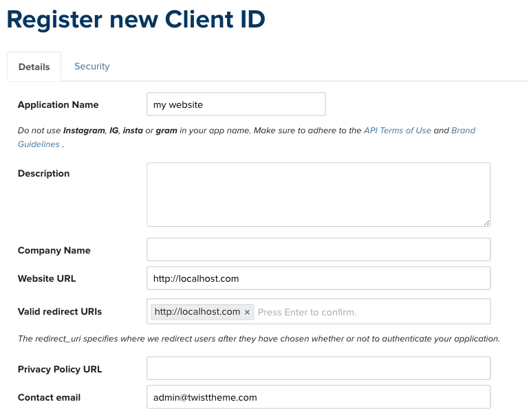
3.) At the details section, fill the Application Name / Website URL / Valid redirect URIs and Contact email.
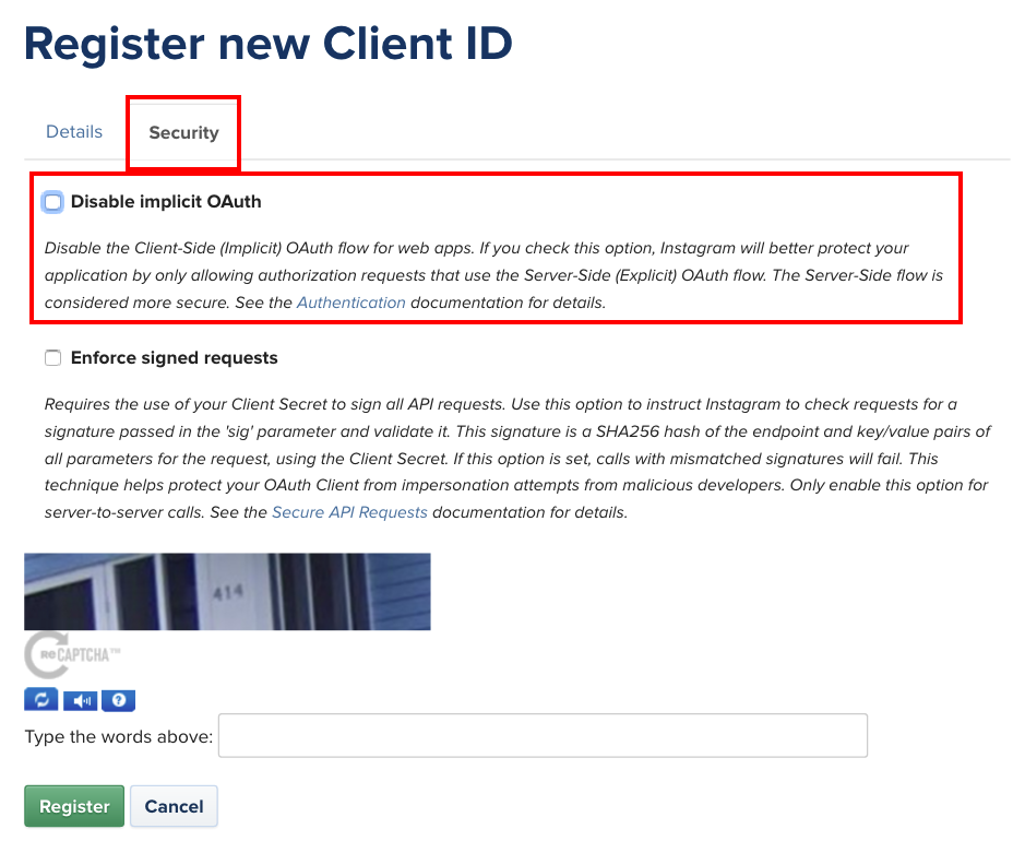
4.) In security section, deselect the "Disable implicit OAuth" option and click register.
5.) Replace the CLIENT_ID and REDIRECT_URL in the below link with the one you registered and click "Authorize" button.
https://api.instagram.com/oauth/authorize/?client_id=CLIENT_ID&redirect_uri=REDIRECT_URL&response_type=token&scope=public_content
6.) After click the authorize button, your browser will be redirect to the url with access token.
http://localhost.com/xampp/splash.php#access_token=xxxxxxxxxxxxxxxxxxxxx
You can copy Access Token out to use with instagram widget.
Reference: https://www.instagram.com/developer/authentication/
Change Custom Stylesheet Directory
You can change custom stylesheet (CSS stylesheet which is generated from customizer) directory for the purpose of developing or organizing file or any other purposes by using add_filter('bateaux_style_custom_dir', your function) in child-theme > function.php like in example below.
function my_style_custom_dir( $style_custom_dir ) {
  return array(
            'style_url' => 'http://www.bateauxtheme.com/content/themes/bateaux/style-custom.css',
            'style_path' => '/var/www/bateauxtheme/web/wp-content/themes/bateaux/style-custom.css'
         );
}
add_filter( 'bateaux_style_custom_dir', 'my_style_custom_dir' );