Page Builder
Bateaux Theme comes with package of live drag-and-drop page builder, Blueprint. Blueprint is unlike other page builder on the market. In Blueprint you can see all the changes in real time while customizing the options. To enable Blueprint, make sure that your plugin Bateaux Core has been activated by going to Appearance > Plugins.
Introduction
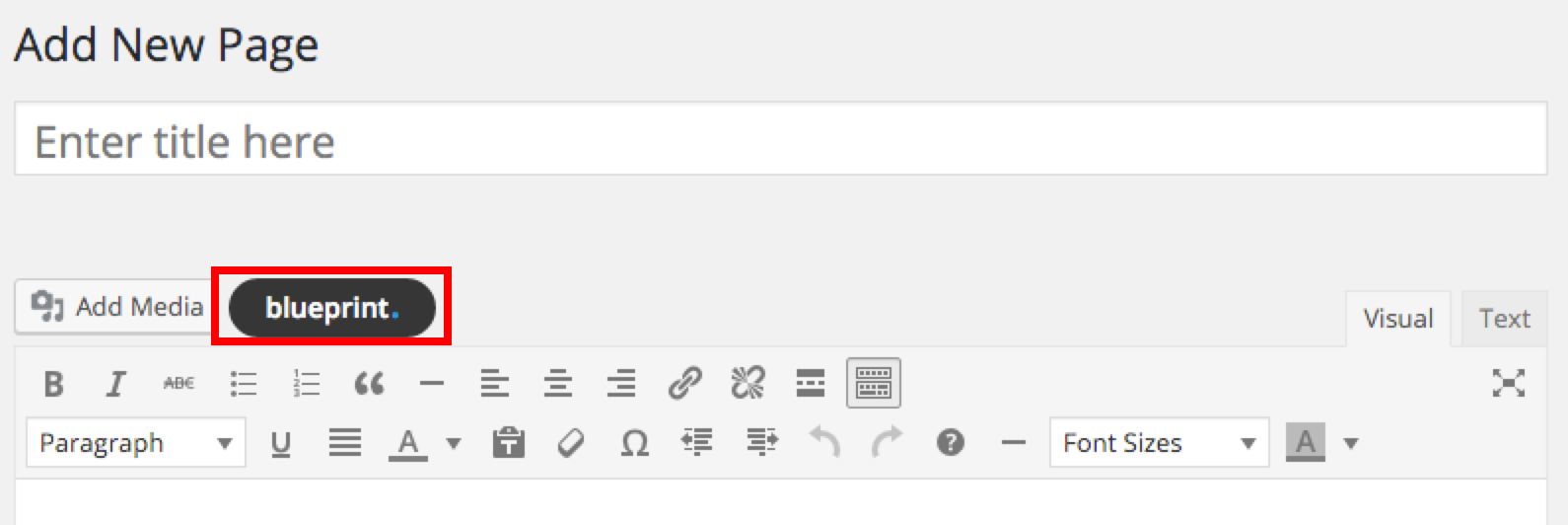
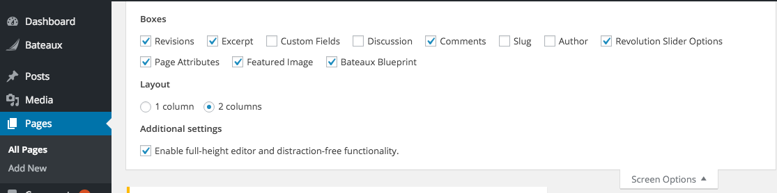
You can choose whether to use blueprint as a page builder or classic editor. To start using Blueprint, click the button blueprint. and you will get access to Blueprint. If you cannot find Blueprint in the page, go to the screen options on the top of the page and check whether Bateaux Blueprint is checked or not.
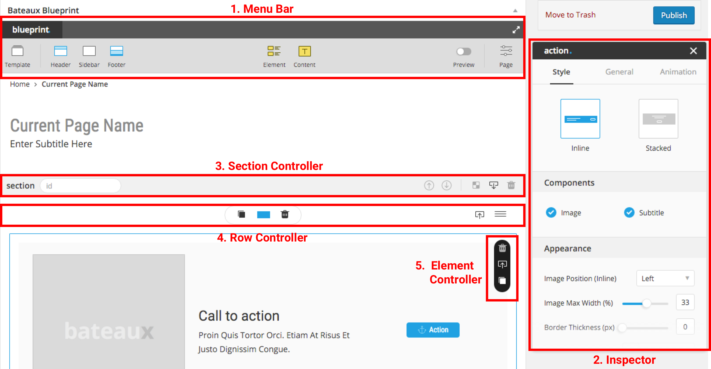
There are 6 main components of the Blueprint, we suggest you to understand before starting to create the pages.
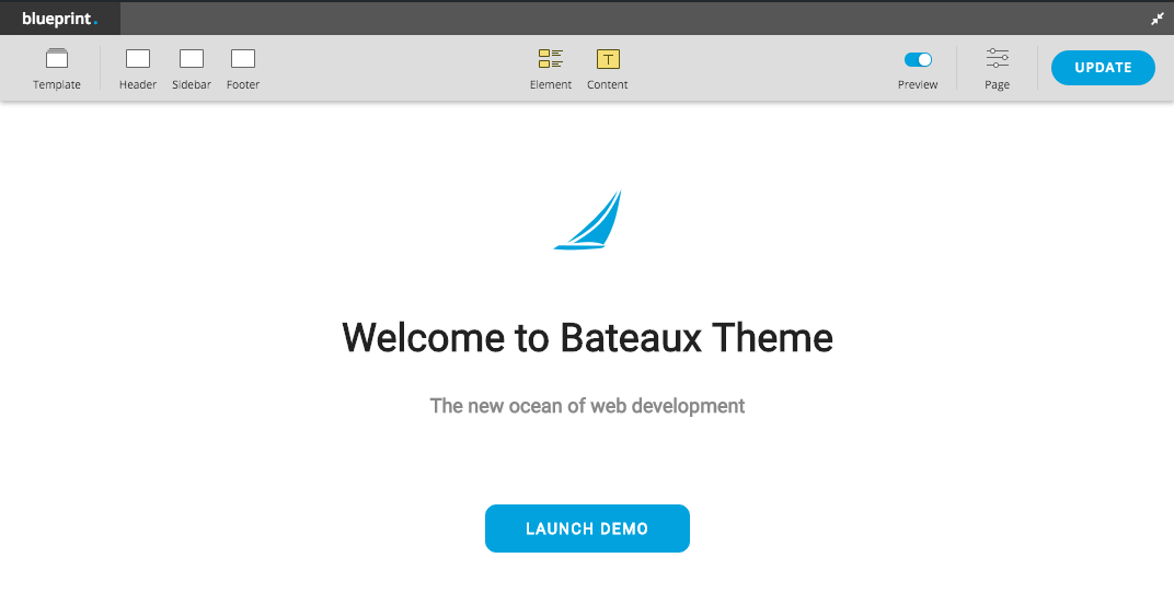
- 1. Menu Bar : save/import/export template, header/sidebar/footer setting, add new elements/contents, preview, page-setting, fullscreen editor mode.
- 2. Inspector : section/element/page options are available to edit here.
- 3. Section Controller : section ID, move section up/down, section background editor, paste item/row and delete section.
- 4. Row Controller : duplicate row, set row layout, delete row, copy row and move row.
- 5. Element Controller : delete, copy, duplicate and etc (depends on element).
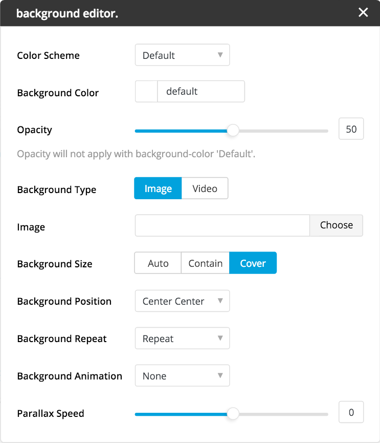
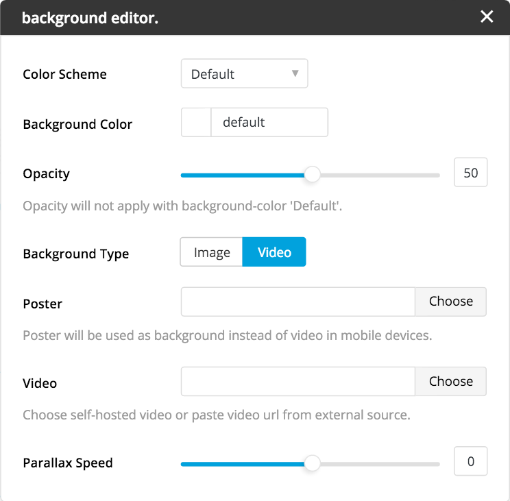
- 6. Editors : media editor, background editor, button editor, text inline editor, pricing editor and etc.
Menu Bar
The heart of blueprint is menu bar, it allow you to create elements and customize page setting. Below are the explanation of main components in menu bar.
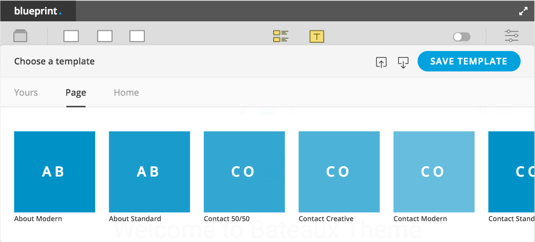
Save / Import / Export template
Importing template is the most convenient way to build the page. There are many prebuilt templates you can choose. When you hover on thumbnail there will be link to that template demo page. Moreover, you can save template to use in the other pages or export template to JSON file in any purpose. Note import / load template will load only the settings, not the contents.
Header
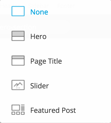
This header doesn't mean of navigation bar but the page header or page title. There are 4 options to use as a header (Hero, Page Title, Slider, Featured Post).
The optional way to manually build your own header is by choosing none then build the header from the first section of the page.
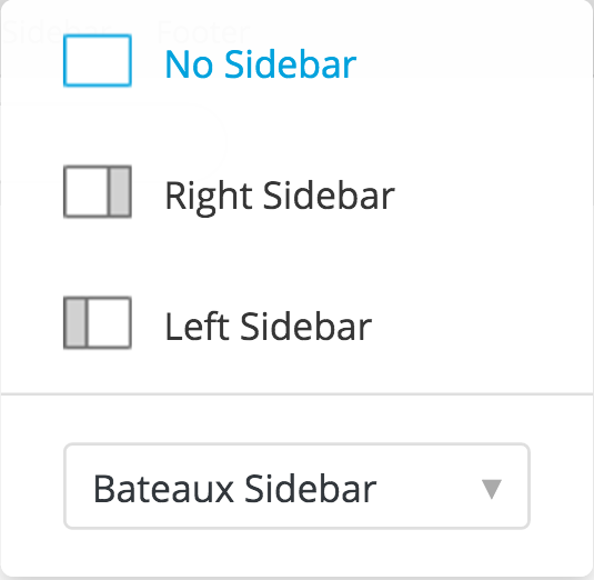
Sidebar
Footer
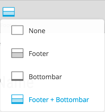
This is the footer setting of the page. You can choose whether to display footer, bottom bar, footer + bottom bar or none.
In order to build custom footer, you can choose **none** and create it in the last section of the page.
Preview
Bateaux Theme preview mode simulates the layout display in front end, it allows you to see the genuine spacing while you can still edit the options. You will be able to see nearly the real page which will display in front end from this Preview Mode. We suggest you to use preview mode in fullscreen editor for better user experience.
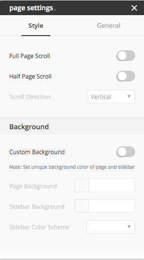
Page Setting
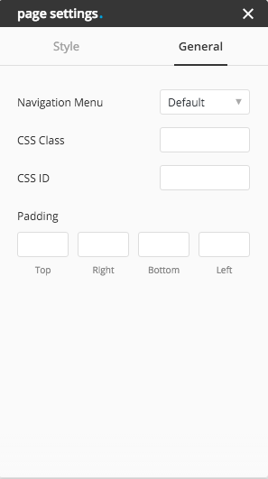
Bateaux theme page setting, is the overall setting of the page. You can choose whether to activate full slide page, half slide page or not. You can set the custom background color to the page and sidebar, in case you want uniqe background color by turning the switch Custom Background on. Moreover, you can choose custom menu for unique navigation bar of the editing page or simply disable navigation bar by select "none" in the navigation menu option (default will use global navigation bar menu).
Fullscreen Editor Mode
Blueprint comes with fullscreen editor mode which will makes your page building experience become simple even in small screen pc.
Inspector
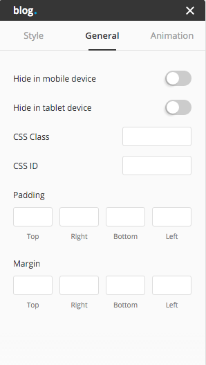
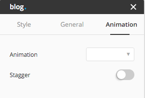
In Blueprint, inspector is the region use for customize options of element, section or page. When you edit the element or section, the current editing item will have the blue border to show it's currently active, and the inspector will show up on the right hand side of the page. Page, section and element inspector are different from each other. In each inspector has it's own unique options. However, options in tab General and Animation are mostly used global. We are giving you one example, blog inspector, to explain the components inside the inspector.
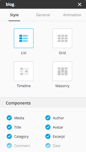
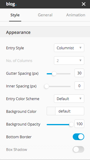
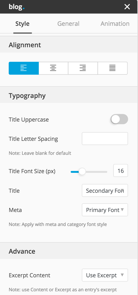
In the Style tab, generally the first section will be "Style" which allow you to choose the style of the element. Beside the style section, Appearance and Alignment section will be the most common section appear almost in every element inspector. You are able to edit the appearance options in this section. Numbers of section in the inspector depends on the element, complicate element will have many sections, such as blog and portfolio. In any element which have Typography section, you are allowed to choose 4 font styles from font manager
For the General tab, the most common tab that every inspectors will have, allow you to edit the padding, margin of the element. Moreover, you are able to add extra class to the element in order to do styling via custom CSS, or add extra ID in order to make an advance setting with box or modal element.
Margin : most of the elements and contents available in blueprint has their own default margin. You can use this margin field to override default value.
Padding : in every element and section has it own default padding value, you can override those default value by input the value in this field.
Grid System
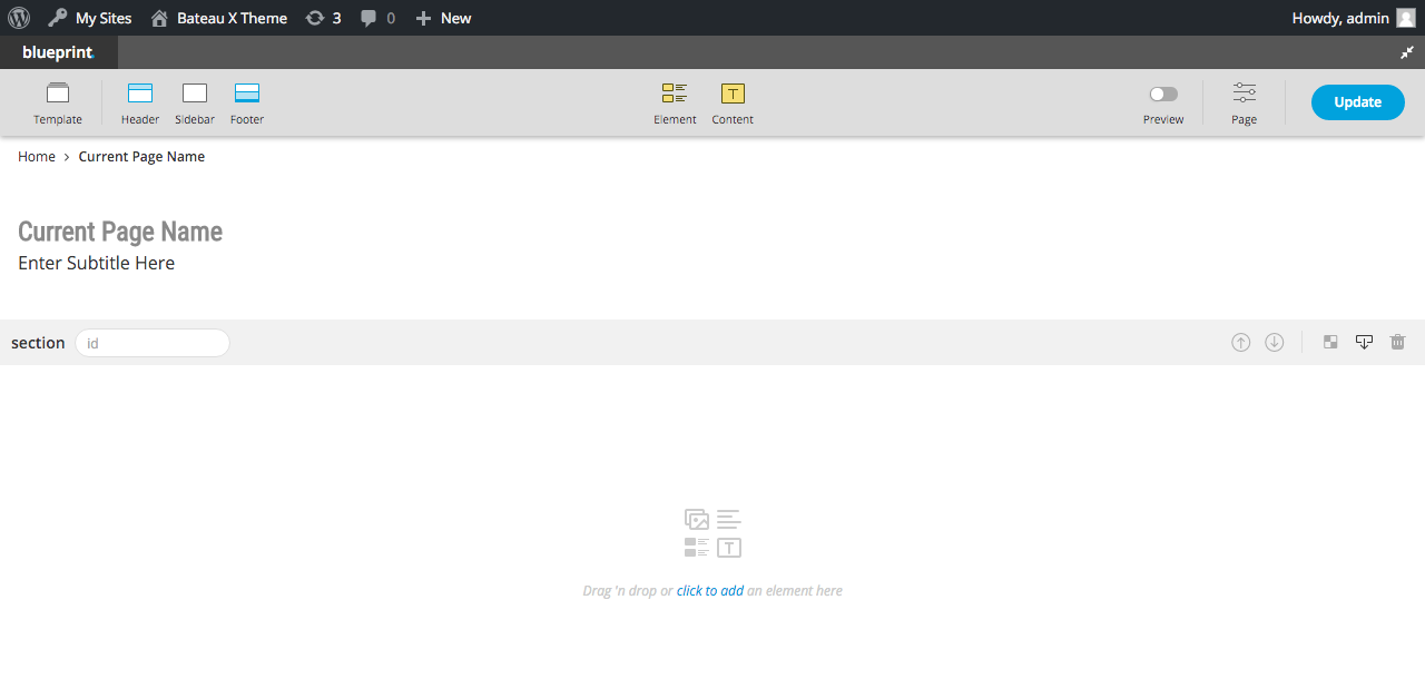
Grid system in Blueprint is very simple. The mechanism is like this Section > Row > Columns. First of all you must have section. After you drag the element in to the section, that element will automatically be wrapped inside the "Row". You can see how to set the columns in this explanation. If you want to create a new section, it's simple just click the button Add New Section at the bottom.
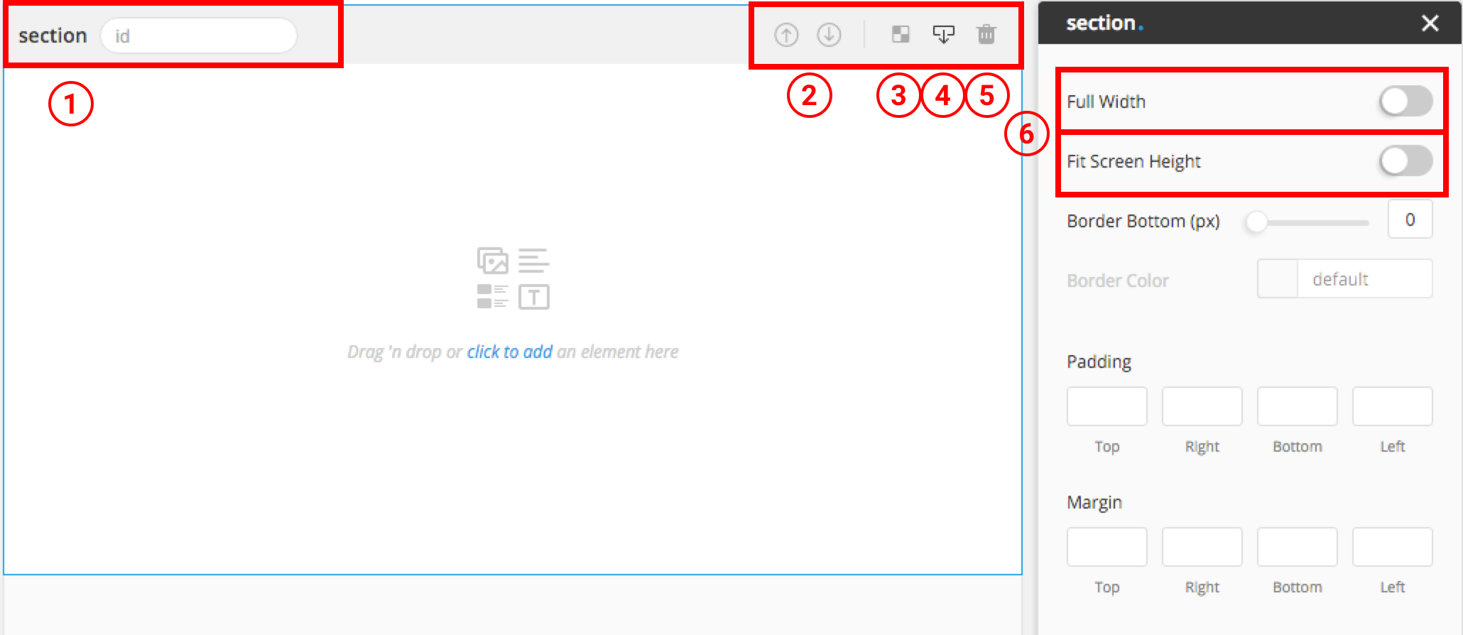
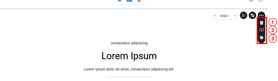
Section Controller
- 1. Section ID : in order to create the one page scroll or custom styling purpose, you might need to define the ID to the section.
- 2. Move Section : moving section is unlike moving element or row. Click the arrow up in order to move the section up, and click the arrow down for moving down.
- 3. Edit Background : click edit background will pop-up background editor.
- 4. Paste Item / Row : in every row controller and element controller has copy feature where you can click copy. The only way to paste the copied item is via this button, you can paste items cross page.
- 5. Delete Sectioon : Be careful to use this button, since it can't be undo after delete, beside you refresh the page without update.
- 6. Full Width / Fit Screen Height : if you check full width option, the section's width will become full 100% relative with the screen width (if the page doesn't have sidebar). if you check fit screen height, the section'height will become full 100% relative with the window height.
Row Controller
This is the part to choose grid layout of the row. You can create as many rows as you want and move row to any place you like in any section. User have option to choose whether to use the preset grid layouts which theme provides, or create custom grid layout yourself.
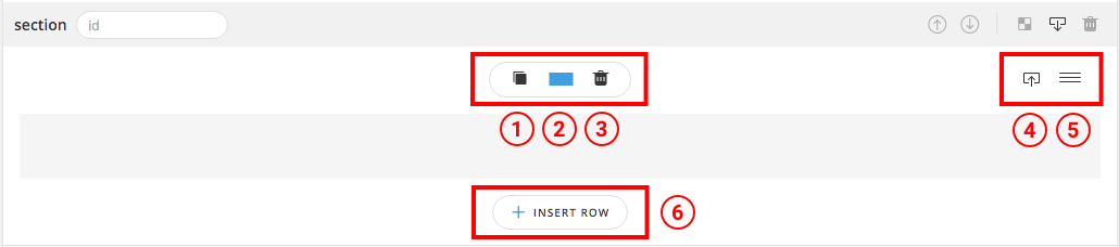
- 1. Duplicate Row : this button will duplicate row and all elements inside with contents and settings.
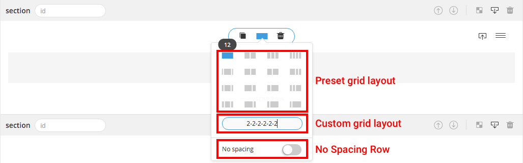
- 2. Row Layout : to set the layout you can use whether to use the preset layout or custom layout
- Custom Layout : to create custom layout, all you have to do is add set numbers with hyphens, which the numbers must be summed to 12. For example, "1-2-3-4-2" (which 1+2+3+4+2 = 12) you will get 5 columns with the width of columns as 1/12, 1/6, 1/4, 1/3, 1/6. Note : 1/5 width of column cannot be created by custom grid layout.
- No Spacing Row : normally row will come with default gutter spacing between columns, if you want to create row without gutter spacing, you have to turn on No Spacing switch.
- 3. Delete Row : click here to delete the row, be careful this action cannot be undone.
- 4. Copy Row : you can copy row to paste in any section you want via paste button.
- 5. Move Row : to move row, just click drag the row at this button position and drag into any place you want.
- 6. Insert Row : to add new row below the current row.
Element Controller
Generally, you will find 3 buttons after hover on "..." button on the top right of every element.
- 1. Delete Element : click here to delete the element, be careful this action cannot be undone.
- 2. Copy Element : you can copy element to paste in any section you want via paste button.
- 3. Duplicate Element : this button will duplicate element with all contents and settings.
Note : In some elements there are more buttons than "...", such as team and slider, which you could find more controls to customize.
Editors
There are many types of editor you can find in Blueprint, the main editors you can find in many elements will be text editor, media editor, button editor and background editor
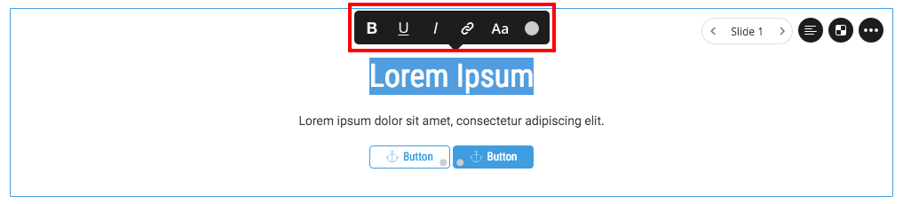
1. Text Editor : allows you to edit the text without any popup or light box. You can simply double click or triple click and select the text you want to edit. Making bold, underline and italic or, changing color and size or even put the link to the text, you can easily customize by text editor.
Note sync colors won't apply with text edited in text editor.
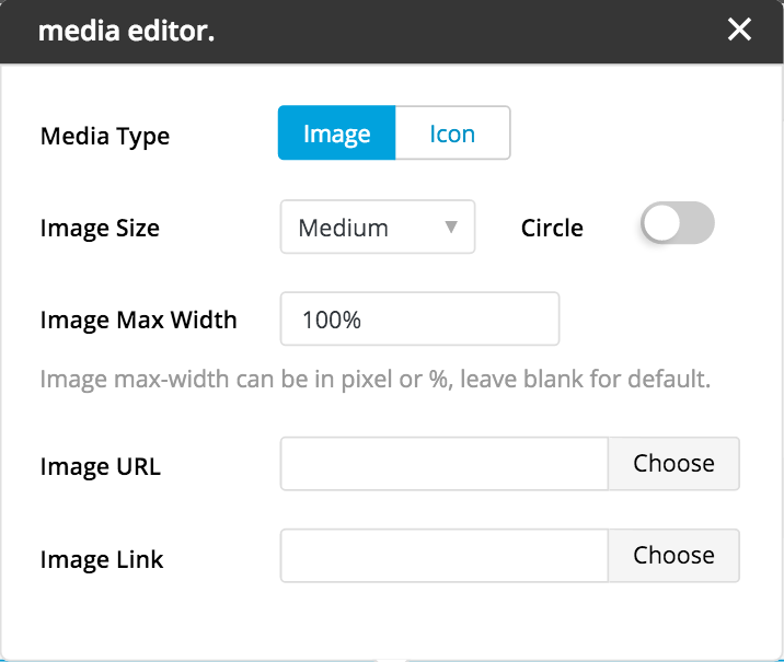
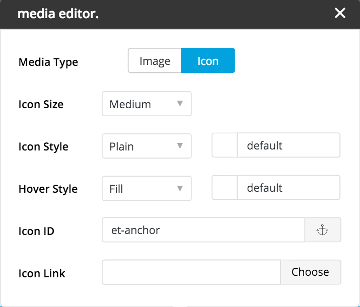
2. Media Editor : allows you to upload image or use icon.
Note: image size option won't apply with external source image url.
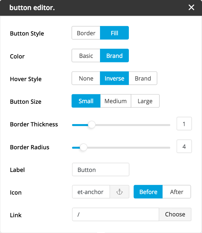
4. Background Editor : this editor is available in some elements and section. This allows you to choose whether to use background image or video (if there is background type option), and also allows you to add background color with desired opacity.
- To use Self-hosted media, click choose button and select the media you want (suggest .mp4 for video).
- To use External source media, copy url of image or video and paste into text input field next to choose button.
- Note: external source video background supports only Youtube and Vimeo hosted video.
Post Builder
For the best user experience in creating single post, Bateaux Theme keeps the original classic editor, so user can simply input only text content. There are 3 main layout you can use for your posts, with many styles of featured media show on top of the post. You can choose whether to use the global settings with the post or custom settings in purpose you want to make unique design.
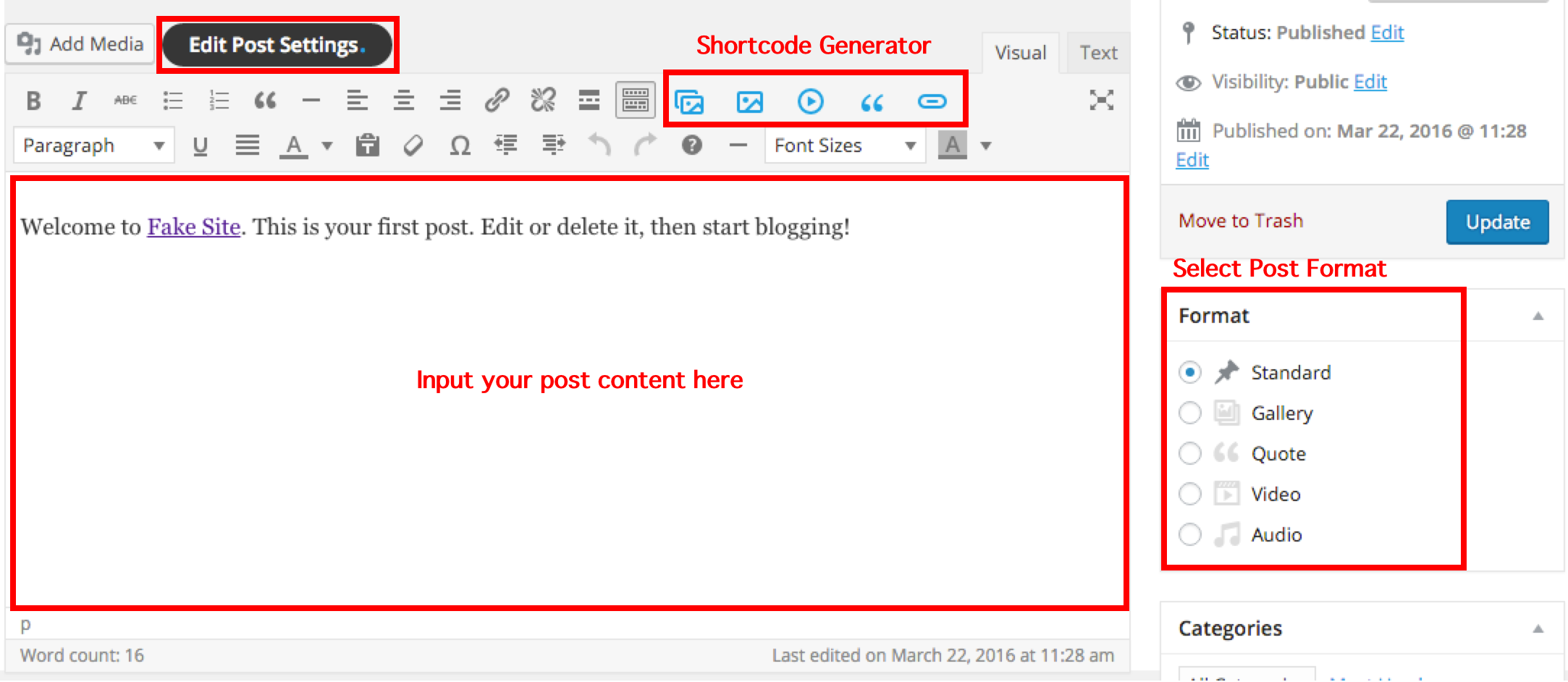
Post Settings
To edit post settings, there is a button on the top of the editor beside the "add media" button. This is similar to customizer but for single post only. User can choose layout of the post, featured media style, and also other settings. In some options which are unavailable to edit will have a light grey label, those options are related with other options, for example "Full Width Media Parallax" cannot be edited, if you don't select "Featured Media Layout" as "Full Width".
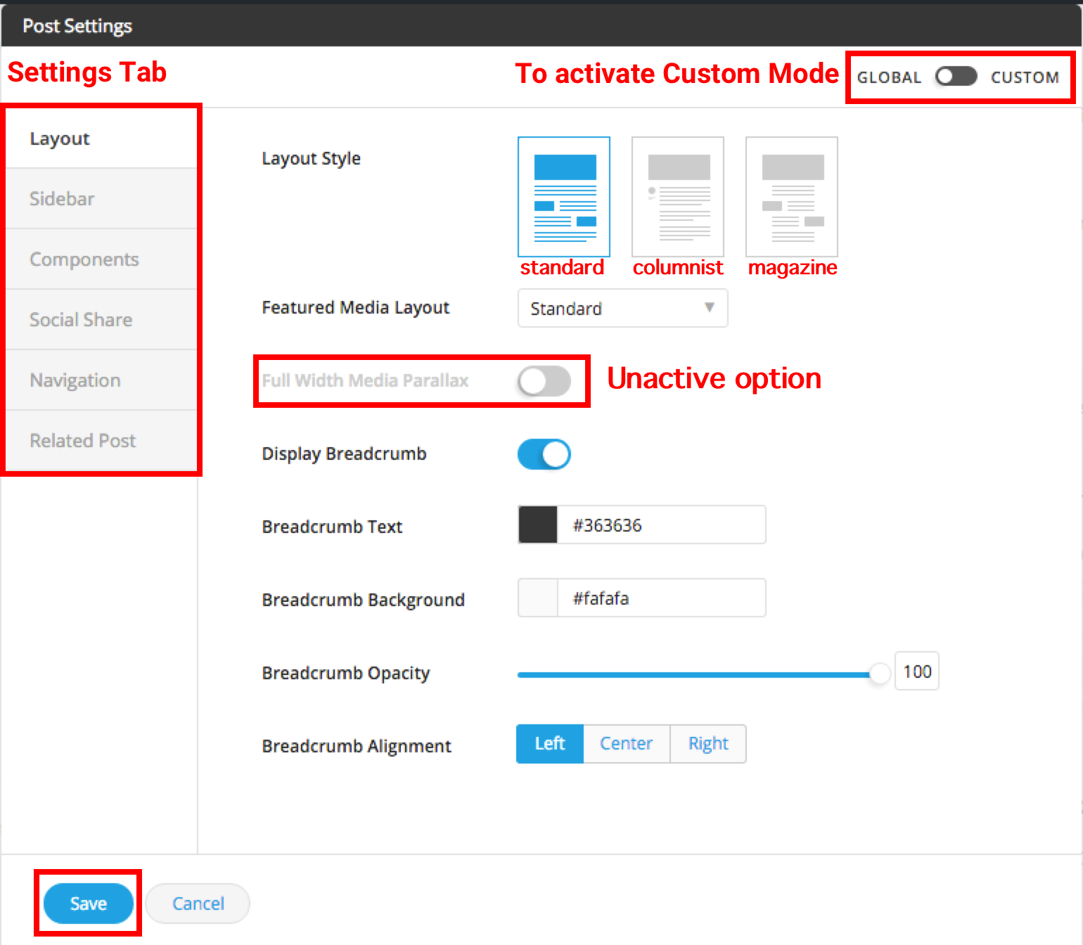
You can choose whether to use global setting, or custom settings with the post you are editing by just change the mode on the top of the editor. Custom mode will change the tab of editor to blue color, this will override all the global settings and apply just only in that post. Don't forget to click save every times you finished customizing. All the changes will lost if you don't save the settings before close. There is no need to click update the post, if you make changes of only settings not contents.
Shortcode generator
There are 2 main options to add media (image, video, gallery) into the content of the post, 1. using WordPress add media button, or 2. using Bateaux shortcode generator. We recommend you to use shortcode generator for more customizable media element. Bateaux theme provides you 5 buttons to generate the elements which are normally used in single post.
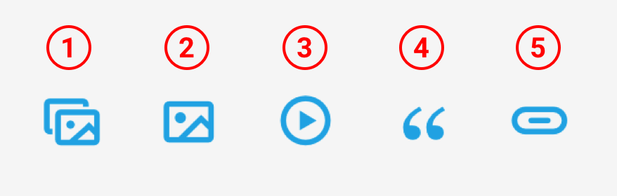
- 1. Gallery : 3 styles of gallery (grid, masonry, carousel) are available here.
- 2. Image : you can choose the ratio of image, add the link and able to set image position as you want.
- 3. Video : you can choose whether to use self-hosted video (suggest .mp4 file) by click upload and select the video you want, or external-hosted video like Youtube or Vimeo by input URL of the video inside the "Video" text input field.
- 4. Quote : are available in 3 styles with fully customizable colors.
- 5. Button : are available in 3 styles with fully customizable options.
For further information how to use more advance shortcode, you can check the documentation here.
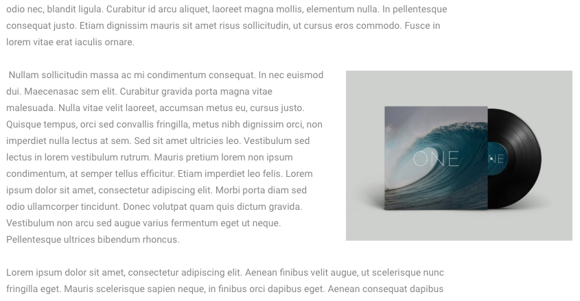
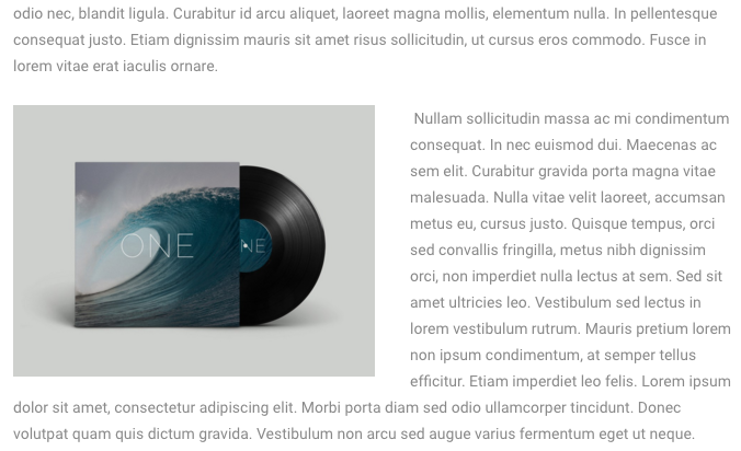
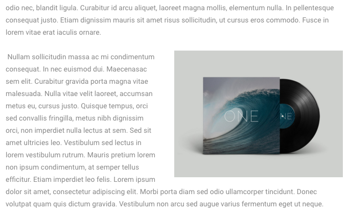
One option in shortcode generator in some elements (image, video and quote) that user might get confuse is "Position", since this option is different with general alignment option. Position property in single post has total 5 possible options.
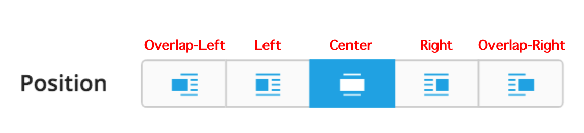
- 1. Overlap Left : makes media element move overlap to the left, out of the content area (displayable in "columnist" and "magazine" post layout)
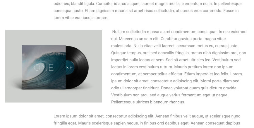
- 2. Left : makes media float left among the contents.
- 3. Center : display block and align media in the center.
- 4. Right : makes media float right among the contents.
- 5. Overlap Right : makes media element move overlap to the right out, of the content area (displayable in only "magazine" post layout)
 Overlap-Left
 Overlap-Right
 Left
Left
 Right
Right
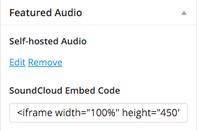
Featured Media
There are 5 post format options that user can select. This will effect with display of featured media in single post and blog archive page or blog element created from page-builder. In every post in any post format, we recommend you to upload featured image together with featured media of each format in case that in some pages (search result or date/month/year archive) all the featured media will be displayed with only featured image. You will find featured media editor below the meta box "Tag" at the bottom right of the post editing page.